Platform McKinsey
From Confusion to Clarity:
The New Billing Experience
Duration
Dec. 2024 - Mar. 2025
Role
Lead Designer
Team
1 Product Manger
2 Backend Engineers
2 Frontend Engineers
To comply with non-disclosure agreement, I have omitted and obfuscated confidential information in this case study. The information in this case study is my own and does not necessarily reflect the views of McKinsey.
About the product
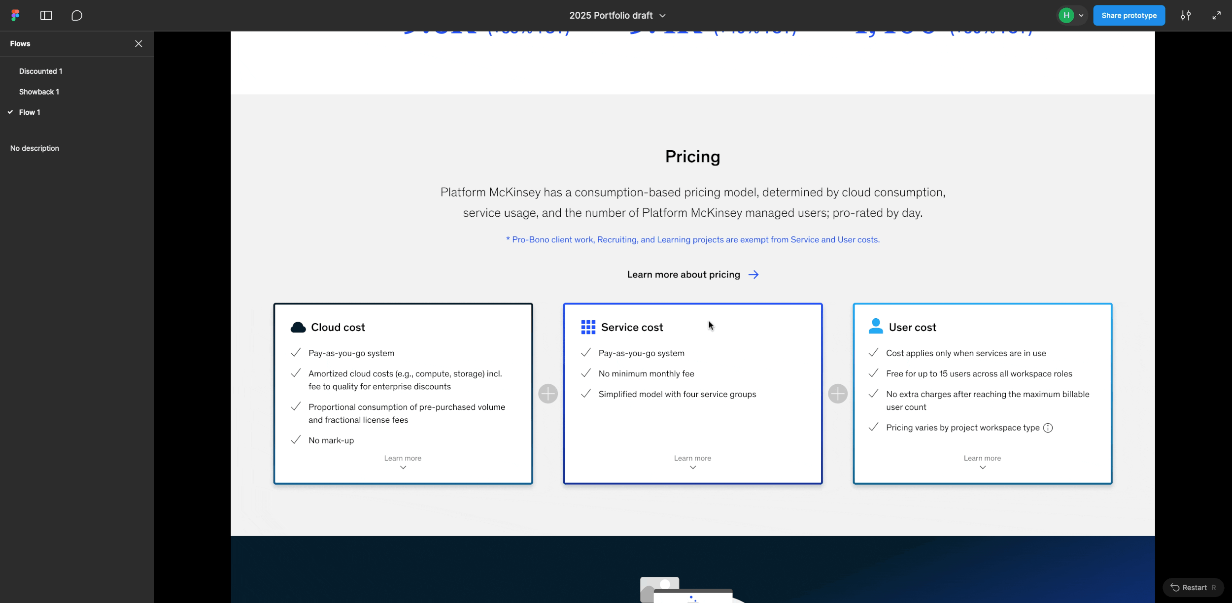
Platform McKinsey is the firm’s primary developer platform, designed to power scalable products and support hundreds of clients for broader impact.
Over the past five years, the platform has evolved significantly—through multiple iterations and names—but its pricing structure remained largely untouched. For users, it became a source of confusion and frustration. As the platform scaled and adoption grew, these gaps in the pricing experience became increasingly apparent. It was time to reimagine how pricing could work.
Aligning Vision Before Design
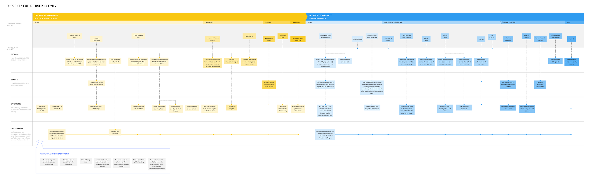
Jul 2023 - Sep 2023, Reimagining Platform McKinsey Future User journey, deliverable from the workshop
This work had been in motion for some time. Reworking the pricing structure to balance vendor costs with transparency required deep leadership alignment. During the 2023 workshop for 2024 roadmap planning, I facilitated a design workshop session to walk leadership through the user journey, surfacing key pain points around pricing—where confusion arose, what users were struggling with, and what needed to change. This session helped put leadership in the users’ shoes and laid the groundwork for a more user-centered pricing model, ensuring focus on what truly matters.
Constraint, Tight Timeline
The team was working in an agile environment, and leadership expected an MVP launch within just six weeks—right through the holiday season. This was a significant challenge given the complexity and breadth of the project, which spanned multiple product surfaces and user journeys, all while ensuring we didn’t compromise on user value.
To deliver on time, I took a focused and pragmatic approach:
🔍 Leveraged existing user insights to address key pain points without starting from scratch
🧠 Validated design decisions with back-end engineers to ensure data availability
🎯 Prioritized ruthlessly, focusing only on what was essential for MVP
🤝 Accelerated alignment, bringing stakeholders into the conversation early and often

Goal
Our goal was to resolve long-standing pain points around billing confusion and lack of clarity by delivering a pricing experience users could easily understand and confidently use for budgeting and decision-making—tailored to the distinct needs of two user groups within the newly merged platform.
To achieve this, my main focus areas were:
🔄 Avoid Ambiguity by Ensuring Continuity
🧭 Design for Comprehensive Yet Clear Coverage
🔍 Prioritize Meaningful Data
🎨 Enable Fast Recognition through Visual Cues
My Role
I led the end-to-end design of the pricing experience—driving user research, facilitating problem-solving sessions, and aligning closely with leadership to deliver clarity and impact.
Current Experience
(What Wasn’t Working)
As a design kick-off, I mapped out the key problems users had already voiced:
Unexplained Abbreviations and Jargon
The UI was filled with internal terminology and acronyms that lacked context, leaving users confused.
Previous billing summary widget
No Detailed Cost Breakdown
Infrastructure and service costs were bundled together. Users couldn’t see what contributed to total charges, making forecasting and budgeting difficult.
“I’m trying to get the fixed and variable cost breakdown… I need to estimate costs if we increase usage of the AI Gateway service.”
Lack of Transparency in Cost Structure
Users didn’t understand how charges were calculated or justified—there was no simple explanation of how the pricing model worked.
“Why is the internal platform charging more than what we use?”
“Terms and data viz are confusing. What is minimum charge-back? Credits? Budgets?”
“I had a Sandbox Azure Analytics learning environment and although I wasn’t actively using any of the services, there was a cost. In a Pay-as-you-Go cloud world how is this possible?”
Previous billing page design
Discounts Not Reflected in the UI
Special pricing like single-user or project-based discounts were managed manually and not visible to users—leading to confusion and more work for our team to explain or manage manually.
“I read that discounts might apply based on the team or charge code, but it wasn’t clear—apparently I need to reach out to find out.”
“I’m supposed to be on the single-user discount, but my bill shows a higher amount than expected.”
This challenge extended beyond solving pain points for end users—it required thinking holistically about the entire ecosystem, including item owners and different groups in end-users.
Previous service detail page design
Level the Billing Experience Across User Groups
After merging two platforms in 2024, the unified experience revealed gaps:
Product teams:
Product Workspace users
(PMs and software engineers)
Unified pricing logic needed
Pricing was set independently by each item owner, with inconsistent formats and language. This inconsistency made it difficult for users to interpret and plan for costs.
Client team:
Project Workspace users
(Consultants, data scientists, and data engineers)
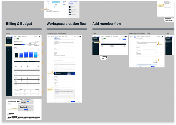
Final Design
Simplify the complex.
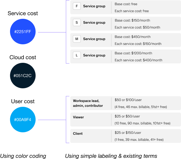
Using visuals as a cognitive shortcut, to simplify information. Made it consistent through out the entire flows.
Surface only what matters.
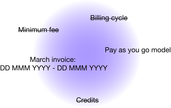
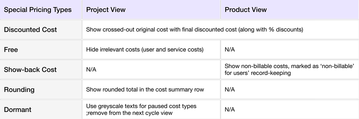
We have special cases such as rounding cost, discounted, TE pricing, Dormant state, free case and testing state. Made sure showing what are relevant and stay consistent in the patterns.
Guide users through the rest.

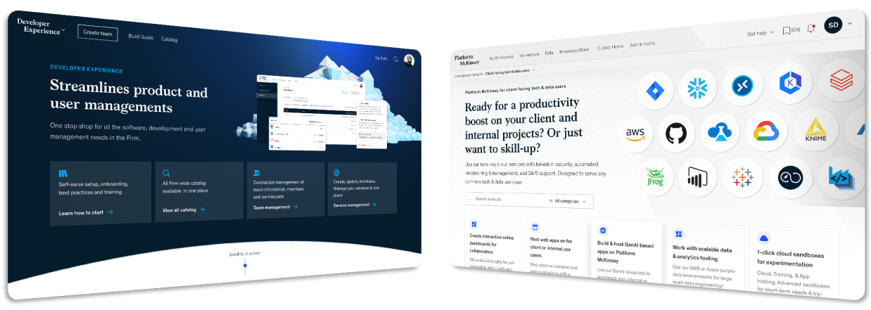
Landing Page:
A Clear Snapshot of New Pricing
Our users are busy and don’t have time to decipher long, dense text. I focused on surfacing only the most essential information upfront—presented clearly and concisely. Additional details are tucked away in expandable cards, giving users control to explore more only if they need to.
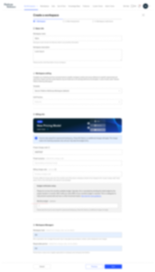
Workspace Creation:
The Start of the Onboarding Journey
As users enter through the landing page, creating a workspace is their first hands-on step in setting up their environment.
At this stage, it’s crucial to set the right expectations and provide visibility into pricing to avoid future confusion.
I designed:
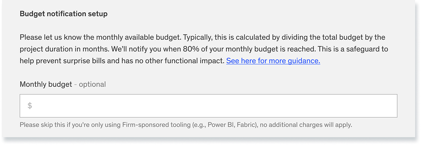
An eye-catching banner to highlight the new pricing model
Budget-setting guidance to help users anticipate costs and prevent surprise bills
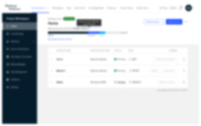
Workspace Home:
Surface What Matters Most
Based on users’ day-to-day workflows, we learned that they don’t need a full cost breakdown on this page—instead, they want a quick, high-level view that helps them stay on top of spending.
The design highlights:
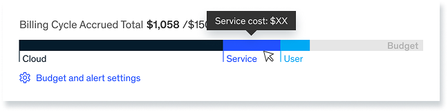
A quick overview of accumulated costs by cost type and total
Per-instance cost visibility to help users spot abnormal charges early
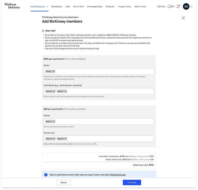
Adding members
Users familiar with the old model may not be aware of this change when adding users in bulk.
To avoid surprises, I introduced a user cost calculator at the bottom to ensure clarity and close the gap. The focus was to simplify key billing details for each user group—clearly showing the maximum billable users, how many are covered for free, and the final cost.
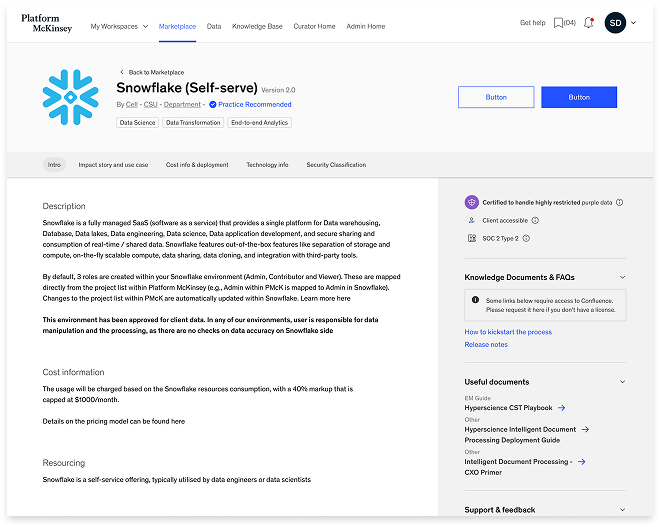
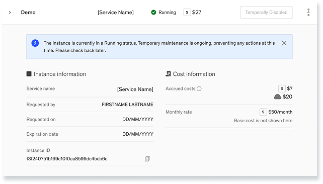
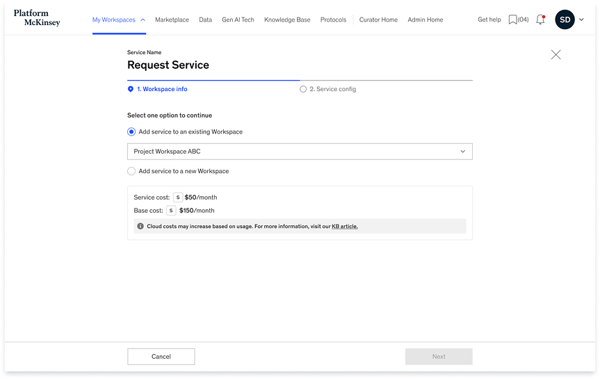
Adding a service
Service costs vary depending on:
The charge code used
Existing services in the current workspace
Workspace type
Special pricing arrangements
Worked with backend engineers that we can fetch the necessary user data to display the correct cost within the flow.
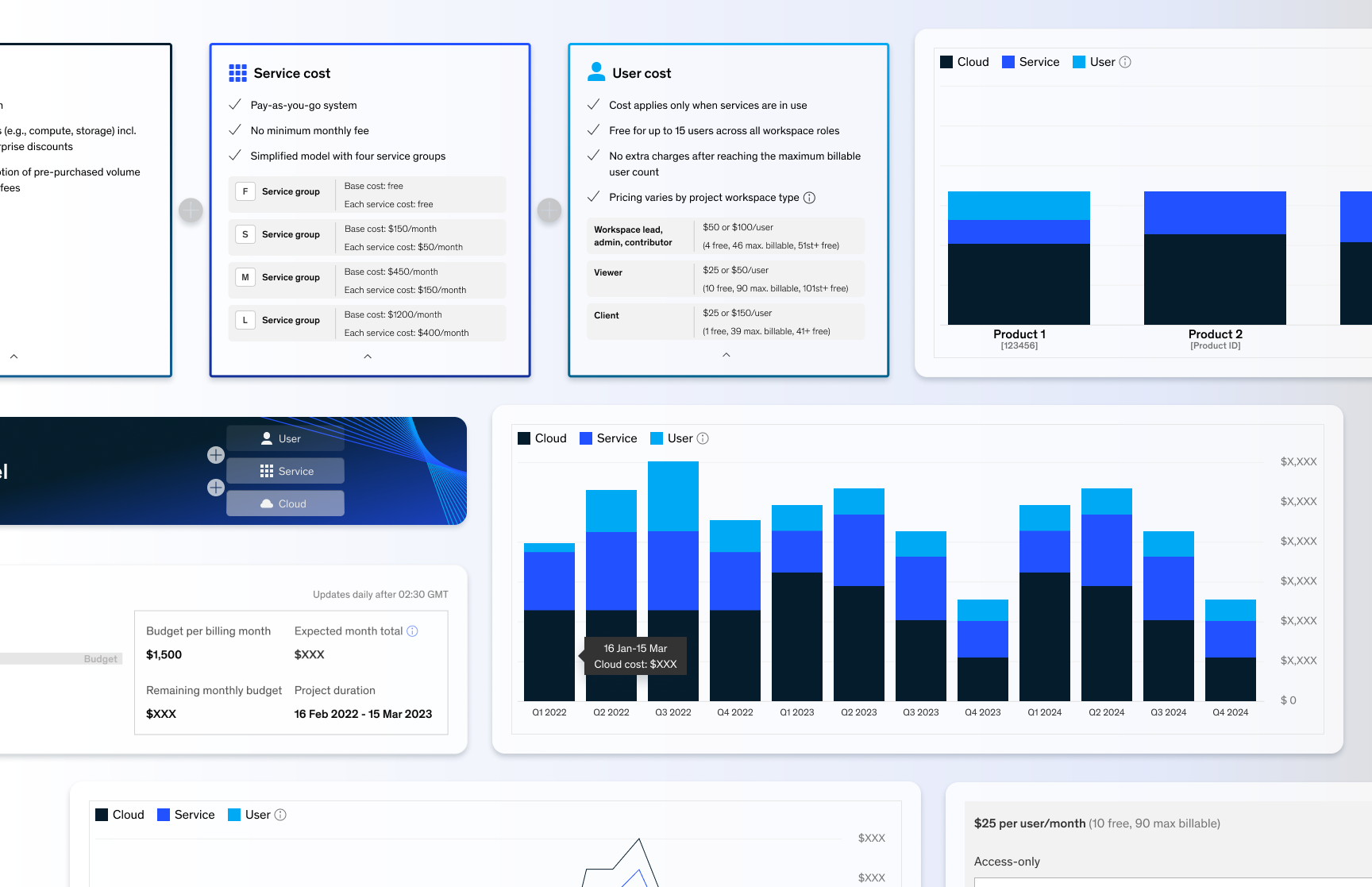
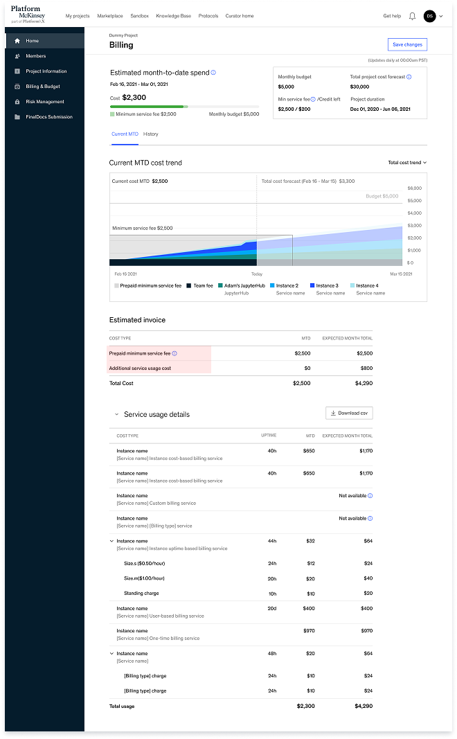
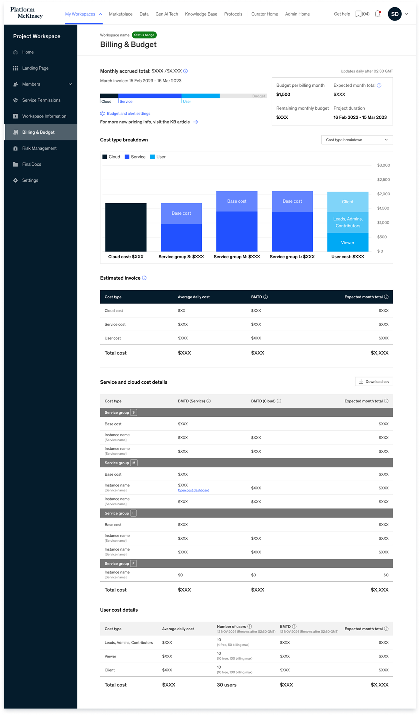
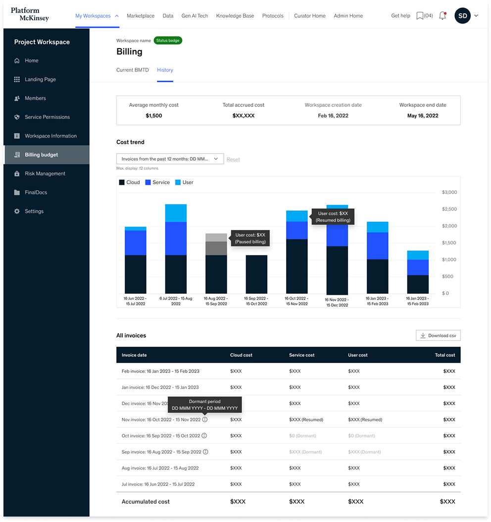
Billing page
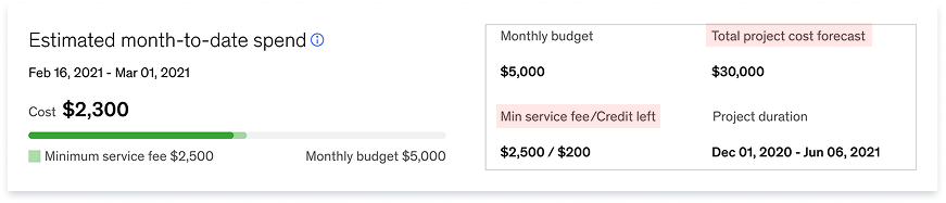
Workspace Budget Snapshot
At-a-glance view of your current spend, budget, and forecast.
Interactive Spend Overview
Visualize costs by category with hover-over details.
Forecasted Invoice Summary
Estimate of what you’ll be billed based on current usage.
What’s Driving Service & Cloud Costs
Detailed breakdown of usage by service groups and associated cloud cost
User Cost Breakdown
Understand how user roles contribute to costs.
Daily Cost Trend
Visualize daily fluctuations in spend to spot usage spikes and estimate future costs.
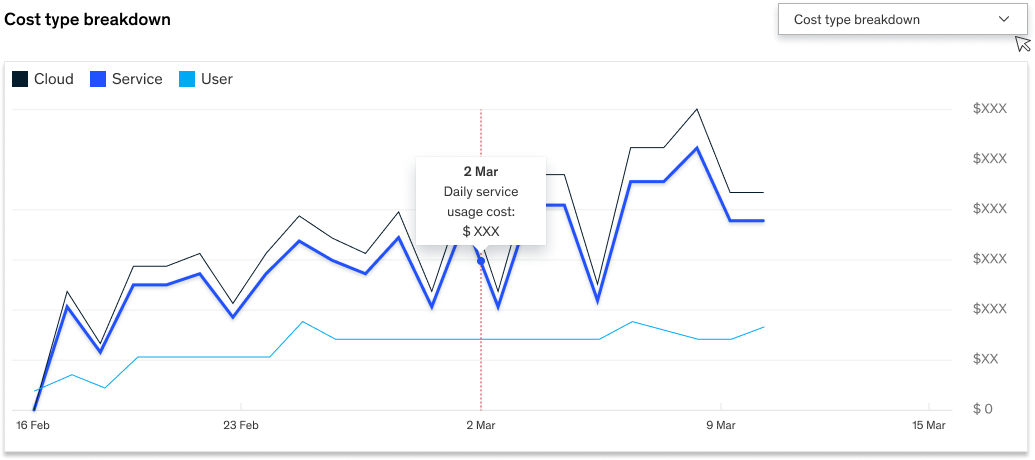
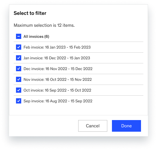
Past invoices
This view allows users to:
Filter and compare up to 10 previous invoices at once
See color-coded bar charts of each month's breakdown by Cloud, Service, and User cost
Hover for detailed data points (e.g. “User cost spike on Nov 2022”)
Access a consolidated invoice table with both monthly and accumulated costs
Export data via CSV for deeper analysis
Using visuals as a cognitive shortcut, to simplify information. Made it consistent through out the entire flows.
No surprises
The new Billing & Budget experience significantly improved clarity and reduced user confusion around costs, pricing, and invoices.
80 fewer inquiries/month
Fewer Cost-Related Inquiries
Fewer Get-Help Tickets
40.6% decrease
Positive User Feedback
All participants responded positively,
User during the interview
“I finally feel in control of our budget.”
How We Got There
The final design was shaped through a series of iterative steps grounded in feasibility, prioritization, and user validation. Here’s what helped us land on the right solution:
Draft and alignment
Collaborated with the product owner and backend engineer to verify:
What data can be shown to users
How certain numbers should be calculated (e.g., projected figures)
Priortization
During this process, I clearly distinguished between must-haves and nice-to-haves, prioritizing each item to support discussions with the PM and help break down the work for developers. I made sure to:
Identify what data can be shown to users
Ensure the right information appears at the right time and in the right place—avoiding surprises by integrating it into key flows and major pages
Cover the essential details users need for effective budgeting
User research: Post-MVP evaluation
I conducted 9 interviews across both product and project workspaces after MVP launch. Participants were selected based on their responsibility over finances and workspace management. These were used to deliver more user-centered design.
Objective
Assess clarity and usability of the released experience
Identify unmet user needs
Understand how users currently budget and manage billing
Gather feedback on new features, including special pricing types and the billing history view
Key insights
Project Workspace Users work on short-term initiatives (1–6 months) and prefer daily or weekly breakdowns to track real-time costs.
Product Workspace Users manage long-term workspaces and budgets, favoring monthly, quarterly, or yearly views to support annual planning.
1. History View Preferences
Both groups frequently run high-compute workloads lasting a few days. They consistently expressed the need to track cost spikes in real time to adjust usage or justify spend.
3. Need for Short-Term Cost Monitoring
Project Workspace Users were often less aware of recent pricing changes. Their focus extends beyond the platform to client work, making it harder to stay updated.
Product Workspace Users, who engage more consistently with the platform, had better understanding and sought clearer communication on applied discounts and pricing logic.
2. Awareness of Pricing Structure
Product Workspace Users explicitly asked for budget alerts—notifications when costs spike or thresholds are exceeded—to support proactive cost management.
This feature is currently not supported, highlighting a clear gap in our offering.
4. Budget Alerts & Notifications